Tag Archives: slider
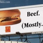
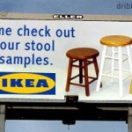
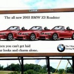
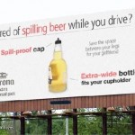
Billboard Humour
Designing a Great Outdoor Ad
Layout
- Make sure your ad has one large, dark element. It may be a heavy dark logo, shape or text.
- Use a simple layout and avoid clutter. Help the reader’s eyes flow smoothly from the top left corner to the bottom right corner of your ad.
- Strong branding: sometimes all you need is a logo and a picture, they will find you online
- Simple Layout
Text
- Make sure your headline is large, wide, and bold.
- Never let your art work overwhelm the wording.
- Don’t print words across/on top of a photograph or illustration.
- Don’t waste words. Examine each word in your ad. Is it necessary? Does it help get your prospect to act now? If it doesn’t help, it hurts.
- Readable copy: avoid big words
Message
- Single-Issue Focus
- What is the single action you want them to do:
- Call you while they drive?
- Turn left?
- Remember a website?
- Tell people what they’ll lose if they don’t buy or stop (not what they will gain).
- Tell your prospect exactly what you want him to do: “stay left”, “turn left at lights”, “call 723-xxxx”, etc
- Short copy: Main message should be 6 words or less.
- Humour is great, if you can get it across quickly in a few words.
Images
- Images must be very high resolution in order to print on a billboard 12′ x 24′
- Ideally the image will have some blank space for your text
- Be aware of what is behind the billboard
- Is it blue sky? stay away from light blue backgrounds
- Is it forest? Stay away from dark green backgrounds
Color and Contrast
- Bold, Appealing Colors
- Remember RED IS A DARK COLOR. Don’t put red text on a dark background, or dark text on a red background.
A high color contrast factor will improve legibility. Here are the best combinations, ranked in order of legibility from a distance:
|
|
|
|
|
|
|
|
|
|
|
|
|
|
|
|
|
|
Distance and Visibility
| Letter Height (Inches) | Distance for Best Impact (Feet) | Maximum Readable Distance (Feet) |
| 3 | 30 | 100 |
| 4 | 40 | 150 |
| 6 | 60 | 200 |
| 8 | 80 | 350 |
| 9 | 90 | 400 |
| 10 | 100 | 450 |
| 12 | 120 | 525 |
| 15 | 150 | 630 |
| 18 | 180 | 750 |
| 24 | 240 | 1000 |
| 30 | 300 | 1250 |
| 36 | 360 | 1500 |
Here are 10 more Tips on Billboard Design
