All posts by Alpine
Stuart H Britt
Mary Wells Lawrence
The Best Advertising Should Make You Nervous About What You’re Not Buying.
Mark Twain
Many a small thing has been made large by the right kind of advertising.
Billboard Humour
Tip #2
Red is a Dark Colour
| Don’t put red text on a dark background |
| or Dark text on a Red background |
Tip #1
The fear of LOSS is greater than the desire for GAIN.
This means you should tell your target audience what they will lose if they don’t act now.
Your prospect fears losing something MORE
than he wants to gain or achieve something.
Ted Turner
Early to bed, early to rise.
Work like hell and advertise.
Robert Fleege
“The billboard is finished, when you no longer can find a single element to remove”
Designing a Great Outdoor Ad
Layout
- Make sure your ad has one large, dark element. It may be a heavy dark logo, shape or text.
- Use a simple layout and avoid clutter. Help the reader’s eyes flow smoothly from the top left corner to the bottom right corner of your ad.
- Strong branding: sometimes all you need is a logo and a picture, they will find you online
- Simple Layout
Text
- Make sure your headline is large, wide, and bold.
- Never let your art work overwhelm the wording.
- Don’t print words across/on top of a photograph or illustration.
- Don’t waste words. Examine each word in your ad. Is it necessary? Does it help get your prospect to act now? If it doesn’t help, it hurts.
- Readable copy: avoid big words
Message
- Single-Issue Focus
- What is the single action you want them to do:
- Call you while they drive?
- Turn left?
- Remember a website?
- Tell people what they’ll lose if they don’t buy or stop (not what they will gain).
- Tell your prospect exactly what you want him to do: “stay left”, “turn left at lights”, “call 723-xxxx”, etc
- Short copy: Main message should be 6 words or less.
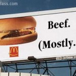
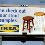
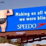
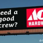
- Humour is great, if you can get it across quickly in a few words.
Images
- Images must be very high resolution in order to print on a billboard 12′ x 24′
- Ideally the image will have some blank space for your text
- Be aware of what is behind the billboard
- Is it blue sky? stay away from light blue backgrounds
- Is it forest? Stay away from dark green backgrounds
Color and Contrast
- Bold, Appealing Colors
- Remember RED IS A DARK COLOR. Don’t put red text on a dark background, or dark text on a red background.
A high color contrast factor will improve legibility. Here are the best combinations, ranked in order of legibility from a distance:
|
|
|
|
|
|
|
|
|
|
|
|
|
|
|
|
|
|
Distance and Visibility
| Letter Height (Inches) | Distance for Best Impact (Feet) | Maximum Readable Distance (Feet) |
| 3 | 30 | 100 |
| 4 | 40 | 150 |
| 6 | 60 | 200 |
| 8 | 80 | 350 |
| 9 | 90 | 400 |
| 10 | 100 | 450 |
| 12 | 120 | 525 |
| 15 | 150 | 630 |
| 18 | 180 | 750 |
| 24 | 240 | 1000 |
| 30 | 300 | 1250 |
| 36 | 360 | 1500 |
Here are 10 more Tips on Billboard Design
